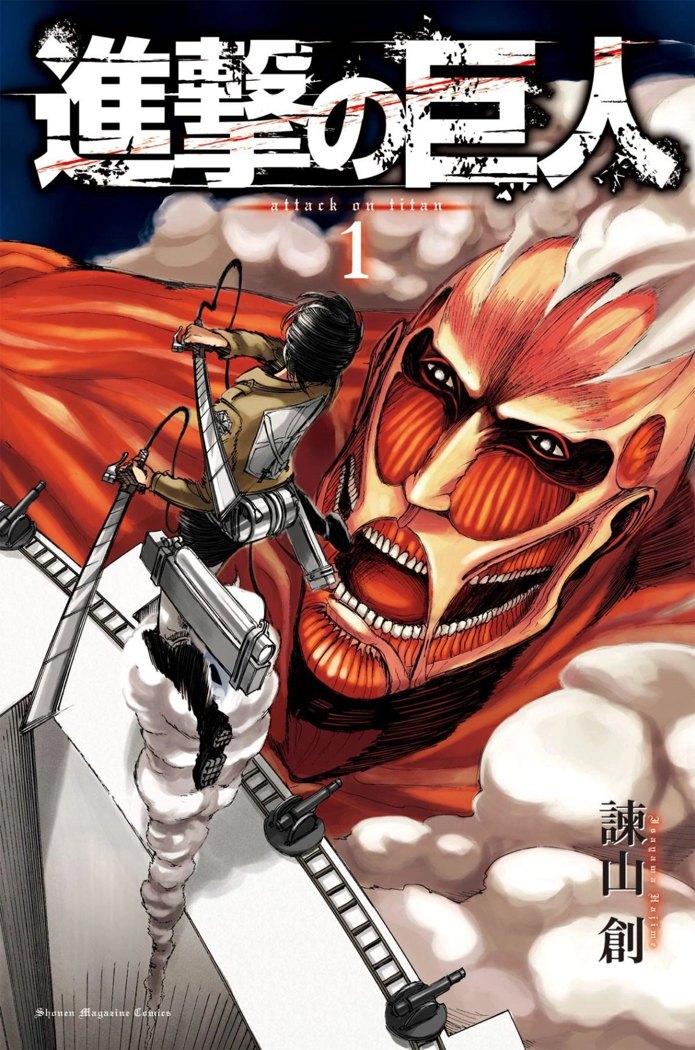
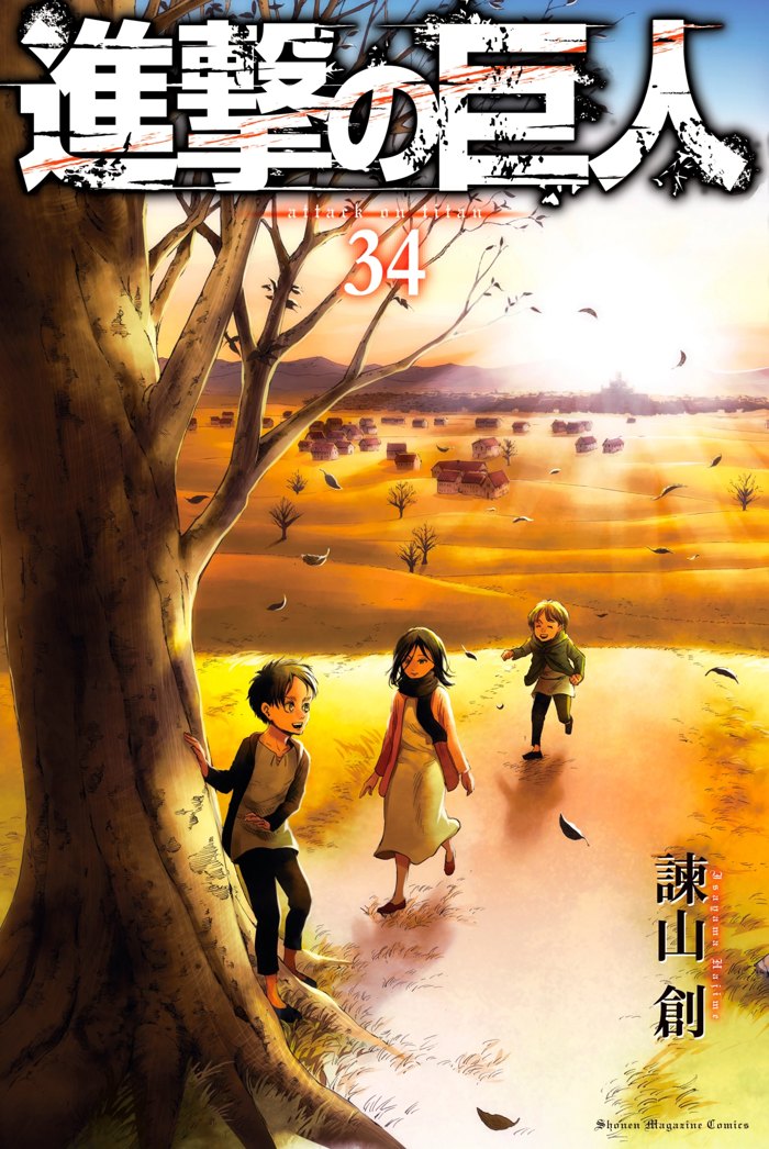
How did Hajime Isayama’s art change across Attack on Titan?
Early Attack on Titan is famous for its roughness, and the first covers own it: hatched, urgent, slightly awkward figures against flat colour. Isayama was a first-time serial artist drawing a monthly chapter alone in a new magazine, and the work has the energy and the wobble of that situation. Through the middle volumes the anatomy steadies, the hatching turns deliberate, and the Titans gain the fleshy, observed weight that made them frightening rather than cartoonish.
By the final arc the covers are painted compositions, quiet, balanced, almost serene: volume 22’s children at the sea, volume 34’s run toward the tree. Critics who dismissed the 2009 art as amateur were answered by the object itself; the gallery is the evidence, hung in order. Isayama has said the improvement was simply the job: one chapter a month, 139 times.
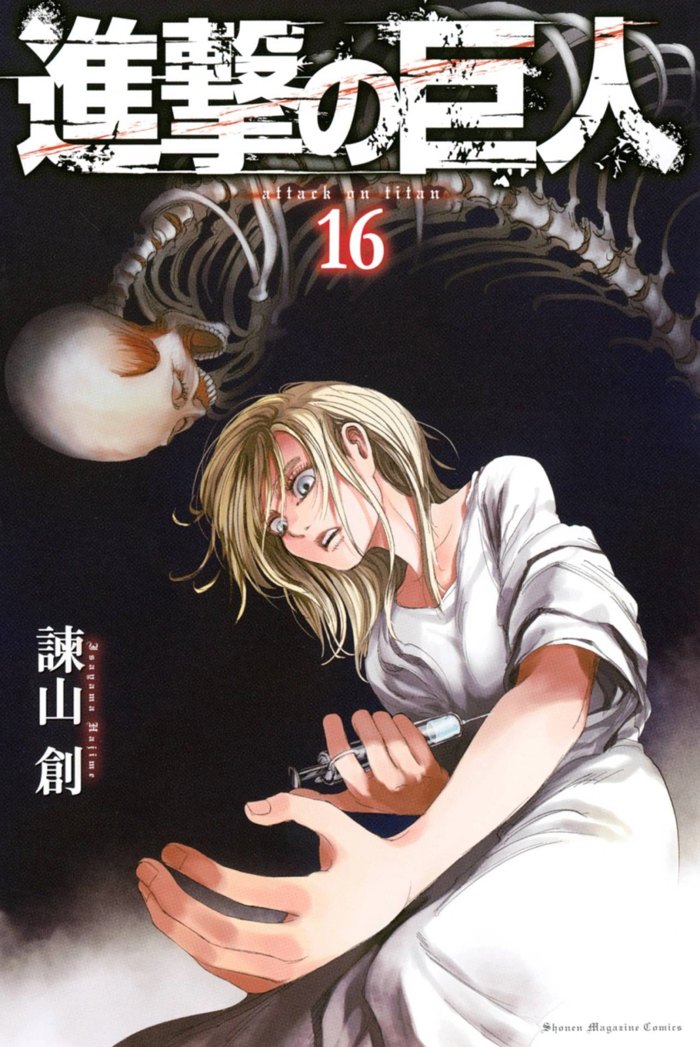
THREE COVERS, THREE ERAS
Read them in sequence