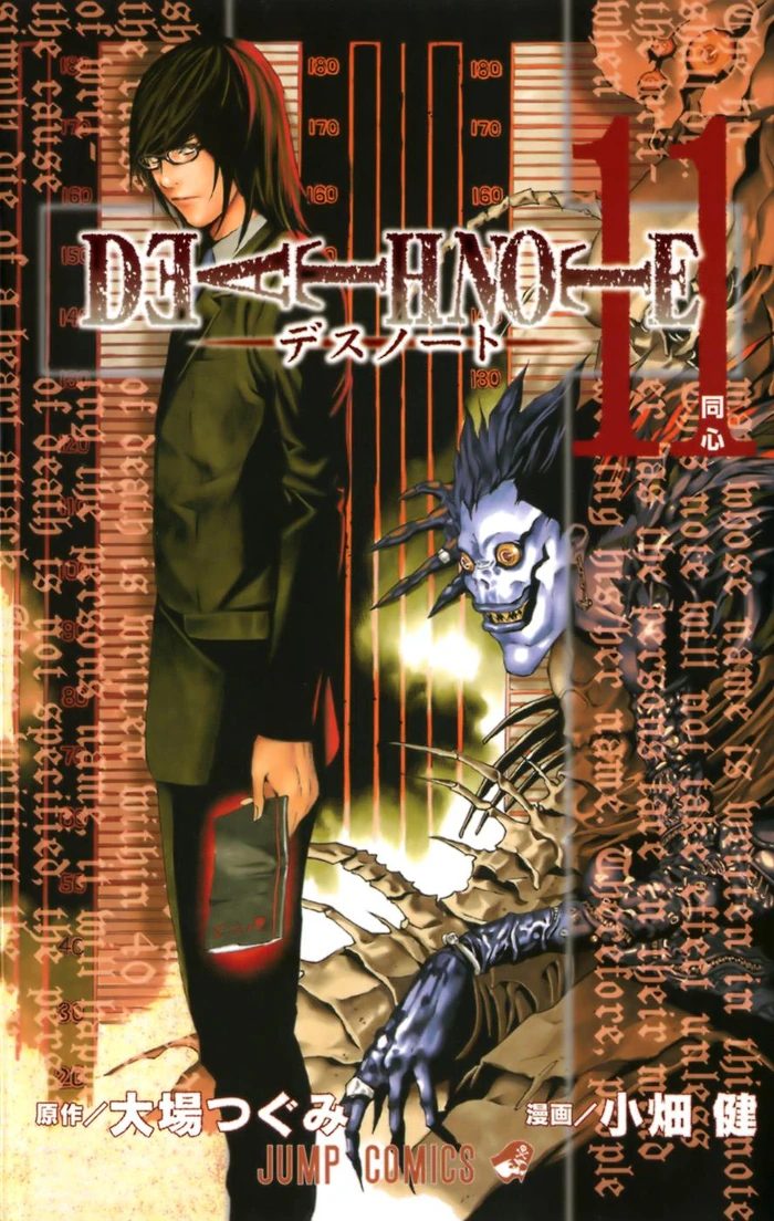
What inspired Ryuk's design?
Takeshi Obata's first Ryuk was unrecognizable: a young man much like Light himself, dark haired and winged. Obata's concept for the shinigami was that they should look like attractive rock stars, glamorous death gods drifting through the human world. Then the artist checked his own design against the story and found the flaw: if Ryuk looked like that, he would read as the protagonist. A death god more beautiful than his human would unbalance every panel the two shared. The design was scrapped, not refined, erased, in Obata's own account, and the monster was built from the decision that Ryuk did not have to look like a person.
What replaced him is the Ryuk of record: grey skinned, long limbed, with a grin too wide for his face, yellow eyes, a heart for an earring, and feathers at his back. The redesign also solved the story's tonal problem. Death Note needed its god of death to be frightening at first sight and funny by the tenth chapter, a creature who could loom over a killing and then beg for apples. The rock star could only have loomed. The goblin Obata built instead can do both, and his face, part skull, part clown, is the series' whole argument in one design: death is grotesque, and it is also, to itself, bored and faintly ridiculous.
One influence is often attached to the design, and it is labeled here as the secondary claim it is. Retellings of the How to Read interviews note Obata's fandom for Tim Burton, with Edward Scissorhands named as a reference point for the shinigami's spindly, stitched look. It fits the silhouette, and Obata's Burton admiration is genuine, but the documented spine of the design is the rock star story: beauty attempted, beauty rejected, monster chosen, because the human had to keep the spotlight.
FROM ROCK STAR TO MONSTER
The documented redesignTHE BOOK ON THE SHELF
Death Note, in print