Why does Sonic look different on Japanese and American covers?
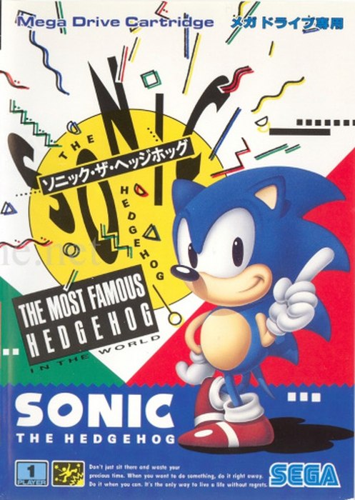
Sonic was designed in Japan by Naoto Ohshima: short, round, with short quills and a round body, a character built to be easy for children to draw. The Japanese package art followed that design, in artwork by Akira Watanabe. The 1991 Japanese Mega Drive box is pop art: Sonic winking and wagging a finger inside a yellow disc, confetti shapes in the air, and the English slogan "The Most Famous Hedgehog in the World" printed like a boast the design is daring you to argue with.
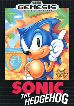
The American box of the same game is a different drawing of the same hedgehog. The North American cover, credited in the reference record to artist Greg Wray, sets a spikier Sonic against a checkerboard Green Hill: the back quills swept up like a mohawk, the smirk wider, the pose cockier, the whole image airbrushed in an American commercial style. Sega Nerds, interviewing Ohshima in 2014, summarized the arrangement directly: Greg Martin, working with Sega of America's marketing department, "tweaked his look to be more attractive to American audiences," and Martin's version of Sonic became the face on American covers and promotion, including his Sonic the Hedgehog 2 box, with Dr. Robotnik crushing a giant number 2, and the American Sonic CD cover.
The split was not only about drawing. A Sega of America team led by product manager Madeline Schroeder "softened" the character concept itself for America, removing the fangs, the rock band, and the human girlfriend named Madonna from the early Japanese concepts. The reference record says this sparked a heated issue with Sonic Team, and that Yuji Naka later admitted it was probably for the best. Ohshima, asked by Sega Nerds in 2014 whether the American redraw had been the right call, declined to resent it: "The culture is different between the United States and Japan. I think what Greg did was supplementary for us. The way he drew Sonic's bowed legs has influenced my own style." He concluded that Sega of America's decision to believe in its artist "was successful."
The two Sonics coexisted for the whole classic era, one on Japanese boxes and one on American ones, over identical games. The arrangement ended by redesign rather than by treaty: for Sonic Adventure in 1998, Yuji Uekawa redrew Sonic once, longer legs, longer drooping quills, green irises, as a single modern design for the 3D era, used worldwide. The cover split is a 1990s artifact, from the years when a mascot was local property in each office that sold him.
THE SAME GAME, TWO HEDGEHOGS
Sonic the Hedgehog, 1991Japanese box vs American box
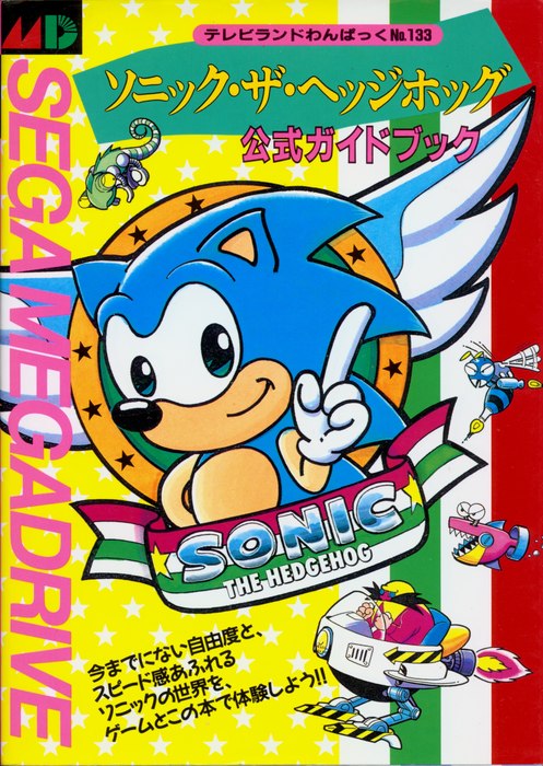
The Japanese official guide book, sold separately in Japan, used the home office's art again, Sonic and Dr. Eggman in his flying machine, drawn soft and round. In America the guide shelf and the game shelf showed a different animal entirely.
THE GUIDE BOOK TELLS THE SAME STORY
Japan's other 1991 Sonic cover