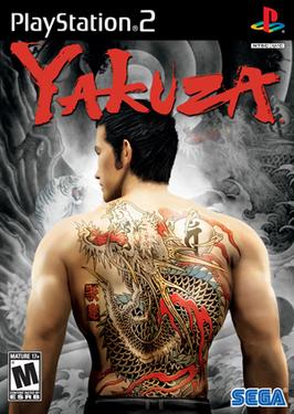
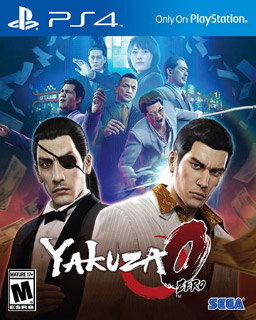
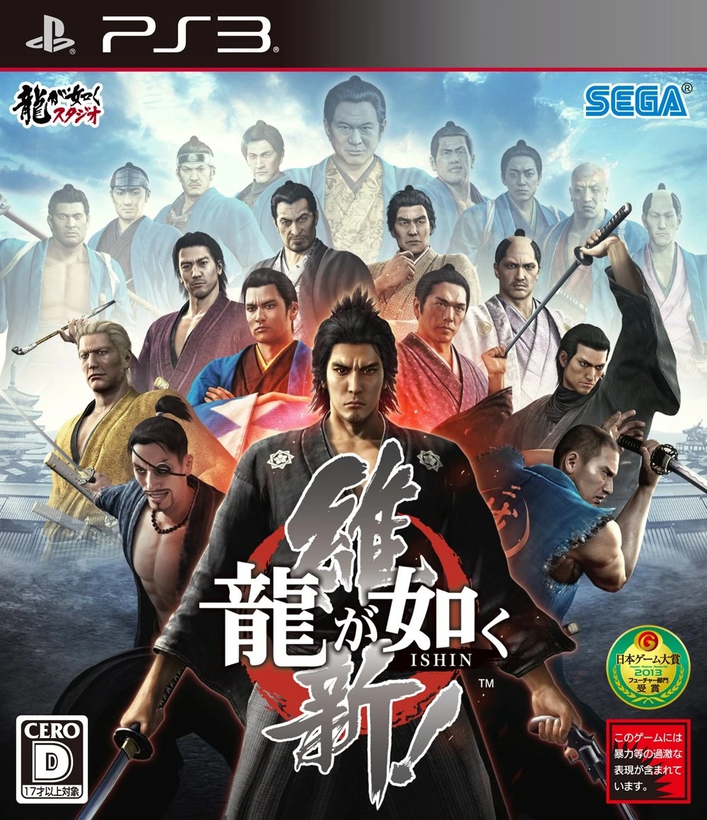
Yakuza box art: Japanese vs English editions
For its first decade the series was packaged as two different products: in Japan, literary crime dramas with painted ensemble covers; in the West, action games wearing Kiryu's dragon tattoo like a warning label. The four pairs below are documented from the physical boxes and key art themselves. Convergence came late, and it came from the Japanese side winning.
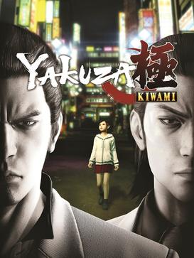
Kiwami (2016 / 2017)
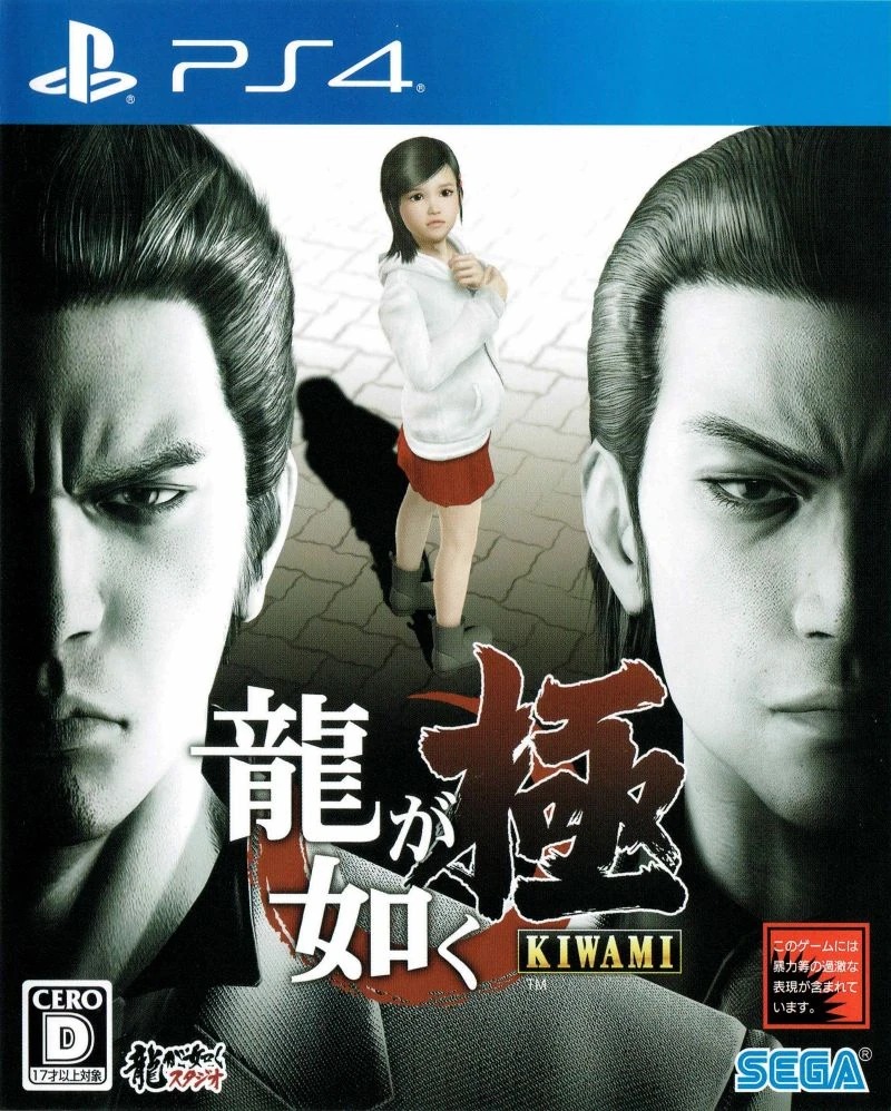
Kiwami is the hinge point: a remake of the 2005 original whose art direction admits the two markets now get the same painting. The differences left are typographic: the Japanese box runs its title down the spine of the composition, the Western art sets it in a block.
Kiwami 2 (2017 / 2018)
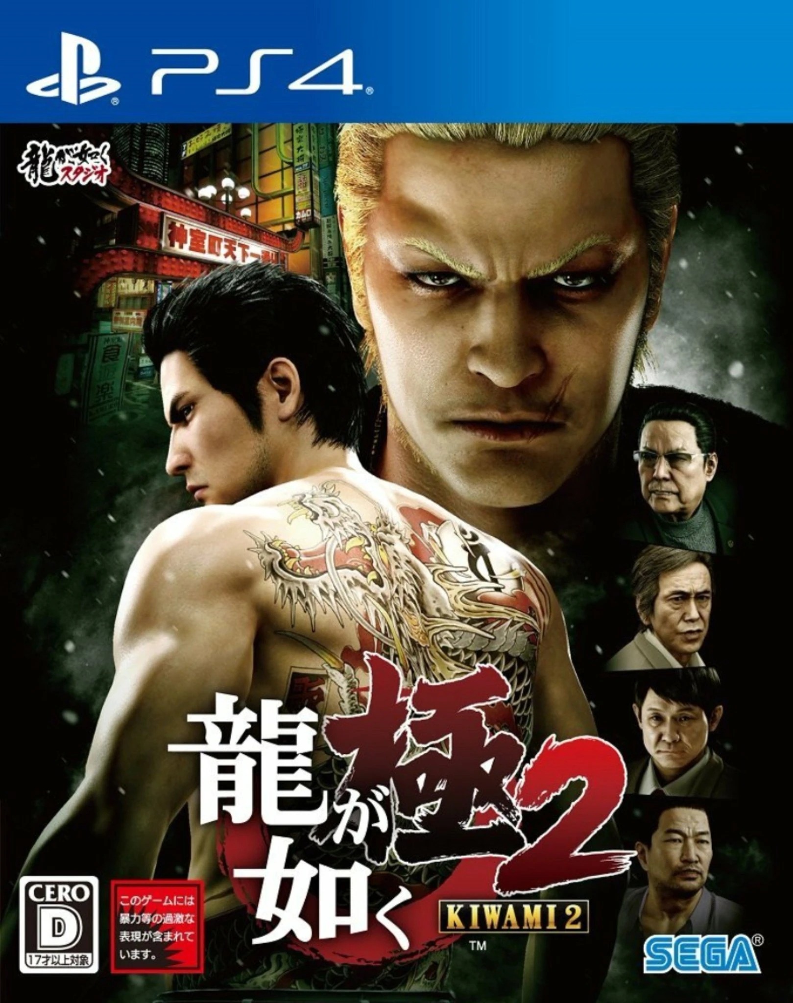
The tattooed-back device began life as Western marketing in 2006; by Kiwami 2 it is the shared global image, with Japan adopting the back and the West adopting the painted ensemble around it.
Like a Dragon (2020)
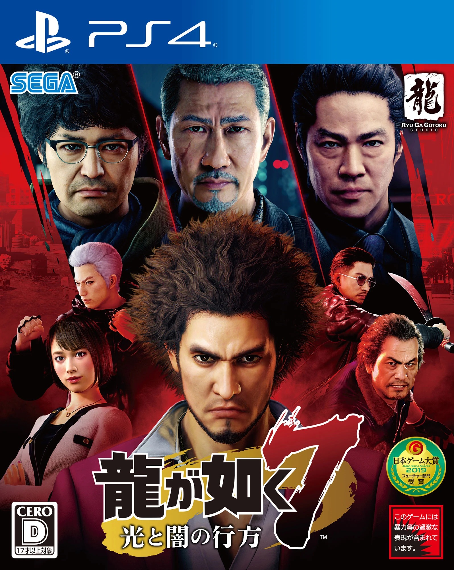
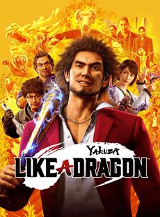
The most divergent pair of the modern era. Japan's box is a red, poster-like cast portrait for the seventh numbered game; the Western art is a warm golden key visual for what was effectively a relaunch, under two titles at once.
Infinite Wealth (2024)
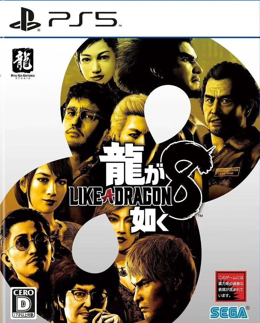
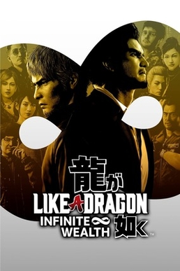
Launched the same day in every territory, Infinite Wealth is the first entry whose packaging is genuinely one global design. Twenty years after the tattoo-back experiment, the boxes finally agree.
SINGLES
Boxes without a pair in this archive