
Are Dorohedoro covers the same in Japanese and English?
Yes. Viz kept every painting. What changed is the frame around it.
For all 23 volumes, the English edition uses the same cover painting as the Japanese original. That is not a given in manga publishing, where covers are routinely cropped, replaced or re-illustrated for export. Here the art crosses over whole, and the differences are typographic.
VOLUME 1
The test caseVolume 1, twice
Same painting · two frames


Nothing in the picture changes. Everything around the picture does.
VOLUME 23
The farewellVolume 23, twice
The farewell, framed two ways
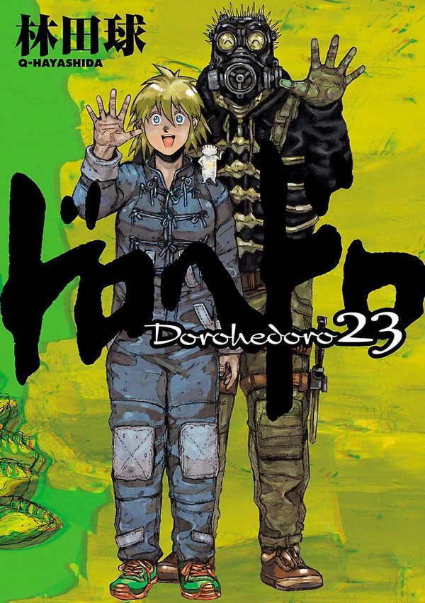
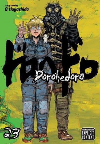
The first and last books make the cleanest test in the run: Viz’s policy never wavered across the decade between them.
WHAT ACTUALLY CHANGES
The frame, itemisedThe logo colour
On the Japanese covers the brush logo is recoloured for every volume, black, red, green, yellow, pink. The English covers standardise it in black, with the title lettered in roman type beneath her brushwork.
The credit
Japanese covers carry her name in kanji and Q-HAYASHIDA in small roman letters. English covers spell it out at the top: story and art by Q Hayashida.
The furniture
English covers add the volume number as a big hand-drawn numeral and carry Viz’s Parental Advisory Explicit Content label. Japanese covers carry no rating on the front at all.
The verdict for collectors
Because the art is identical, choosing between editions is a choice about paper, trim and lettering, not pictures. The Japanese books are the original objects; the English books are the same gallery in a plainer frame.