
Why did the Super Famicom and the American SNES look completely different?
The designer was Lance Barr, Nintendo of America's design and brand director, the same hand behind the American NES. His verdict on the Japanese machine survives in his 2006 Nintendojo interview: "The Super Famicom was maybe okay for the market in Japan. For the US, I felt that it was too soft and had no edge." And the line that followed him forever: the rounded shell "had a kind of 'bag of bread' look."
There was engineering under the taste. Nintendo designed its machines to accept modular components stacked beneath them, and Barr judged the curved Japanese shell poor at stacking. The brief from Nintendo Power era interviews adds the standing order from the NES years: the machine could not look like a toy. And the American shell's famous ridged, grooved top answers a service-department file: NES owners kept setting drinks and cereal bowls on their flat consoles and spilling into the vents, so the new top gave liquids nowhere to sit.
Europe kept Japan's rounded design and its four-color buttons. America alone got the gray and purple brick, with concave purple X and Y buttons set against convex ones so a thumb could tell them apart without looking. The coda writes itself: the bag of bread is the design the world now prints on the merchandise.
THE TWO SHELLS
Rounded vs ridgedSuper Famicom vs SNES
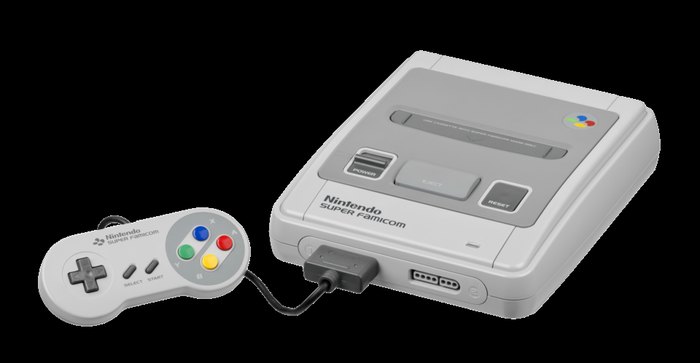
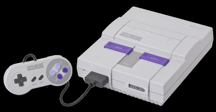
The boards inside are the same. The most successful console war of the 1990s was fought by one machine wearing two bodies.