Why do the Japanese Harry Potter books have different covers?
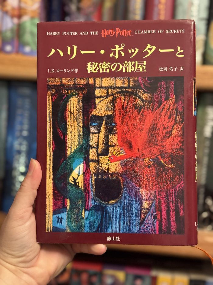
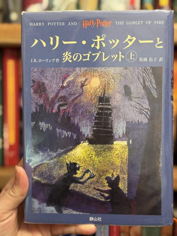
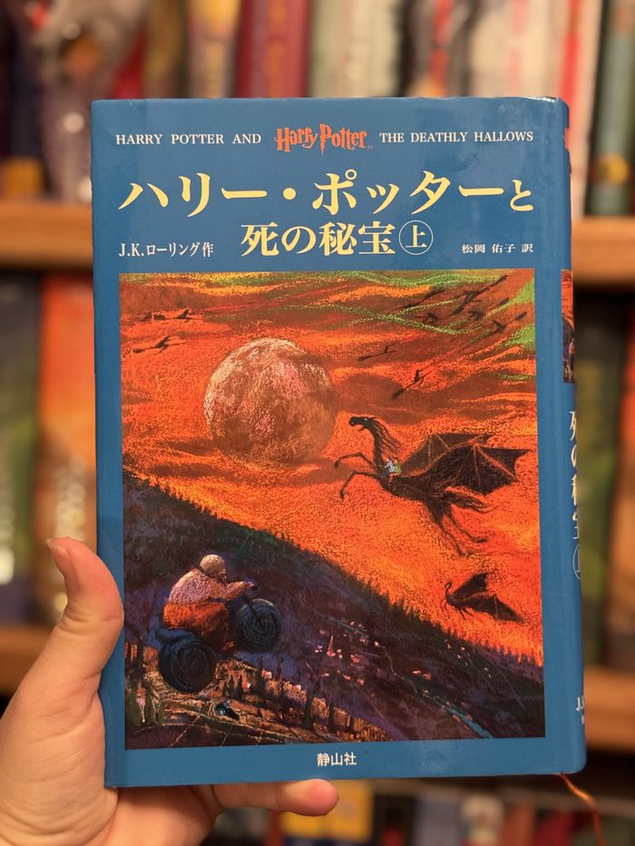
The Japanese Harry Potter is not the British or American book in translation with the cover swapped at the border. The Tokyo publisher Say-zan-sha commissioned original cover art of its own, and for the first six books that art, covers and chapter illustrations alike, came from one painter: Dan Schlesinger. A Japanese first edition of Philosopher's Stone looks nothing like the book an American or British reader grew up with, and that is the point of this page: the covers are how you tell the editions apart.
Britain and America each had their own artist too. The first British edition wears Thomas Taylor's painting of Harry in front of the Hogwarts Express at platform nine and three quarters. The American editions made Mary GrandPré the face of the series in the United States. Japan simply did the same thing, with its own painter, and stayed loyal to him: Schlesinger's covers ran from Philosopher's Stone in December 1999 through the first six books of the original hardcover run, which closed in July 2008.
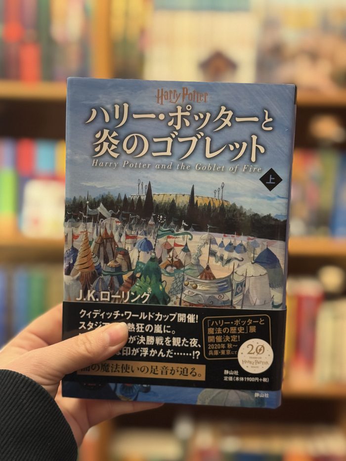
The Japanese art did not stay frozen in 1999. A redesigned hardcover edition in 2019 brought new art by Miho Satake, and the 2022 bunko paperback line brought covers by Chiaki Otonai. One line refused to change: the Pegasus Bunko children's paperbacks kept Schlesinger's paintings, because for a generation of Japanese readers his Harry is simply what Harry looks like.
THE FIRST BOOK, TWO COUNTRIES
Same novel, different paintingsPhilosopher's Stone: Japan vs Britain
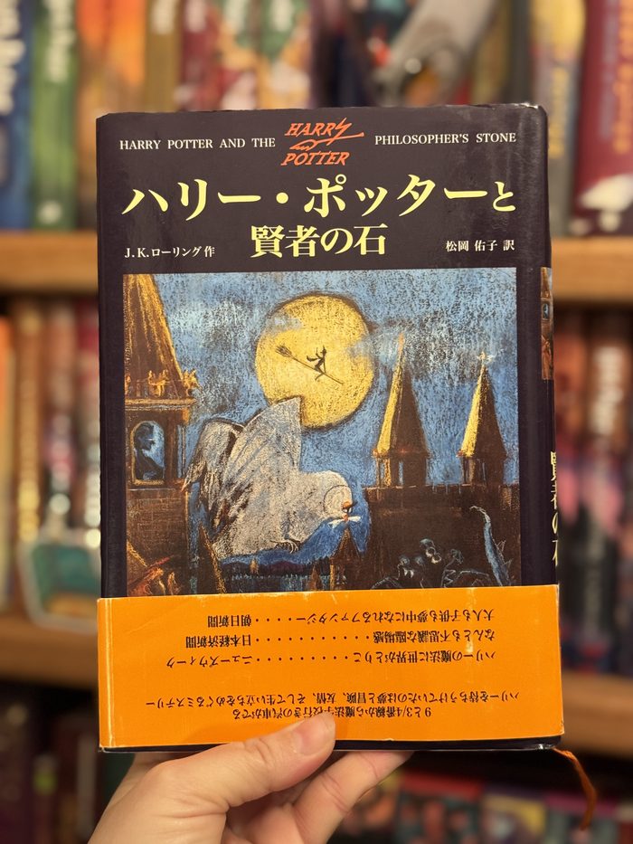
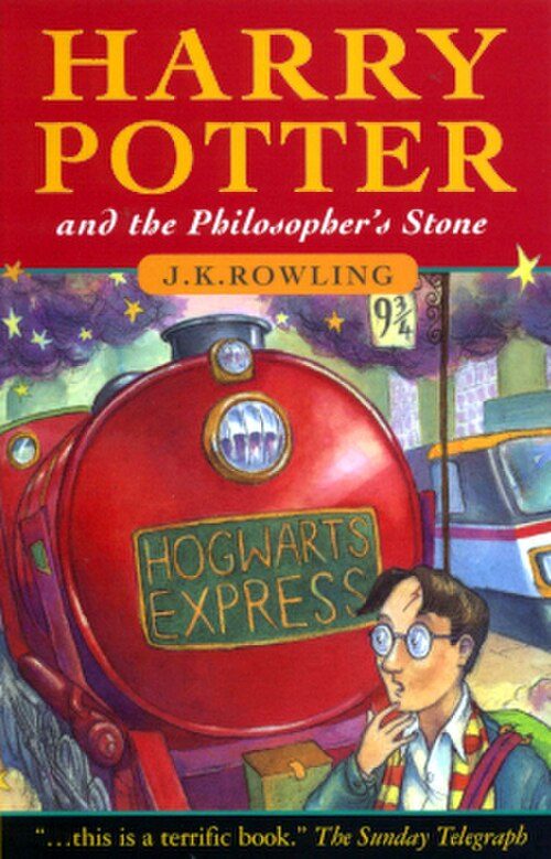
America's Mary GrandPré cover is the third original. Three major editions, three painters, and no shared cover between them: for the first book, the painting alone tells you which country's edition you are holding.
THE SCHLESINGER RUN
The Japanese hardcovers, book by book