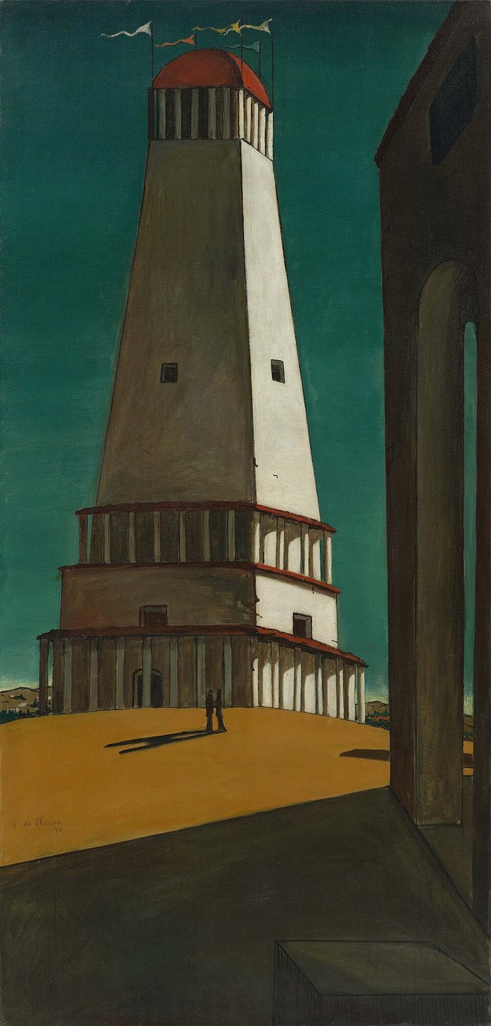
Why does the American Ico box art look nothing like the game?
The cover the world knows is a painting by the game's director. Fumito Ueda drew Ico and Yorda small against a vast, surreal stone landscape, working from Giorgio de Chirico's The Nostalgia of the Infinite: "the surrealistic world of de Chirico matched the allegoric world of Ico." It is one of the most admired boxes ever made. It also did not exist when the American version went to print.
North America released first, on September 25, 2001, months ahead of Japan (December 6) and Europe (March 2002). Ueda's cover was not ready, and neither were several completion features that later regions received. In 2023, Time Extension interviewed the men who made the substitute at packaging firm Beeline Group, creative director Brian Balistreri and CG artist Gregory Harsh. Sony had given them only a few screenshots to work from. Harsh's verdict on the famous mismatch: "It was just a matter of timing," adding that the American package followed the period's conventions: "a big logo and big heads in the background." Hence the windmill, the plank, and Yorda's enormous face.
The regret is on the record too. Yasuhide Kobayashi, vice president of Sony's Japan Studio, later blamed the North American box art, and the unidentifiable English title, in part for the game's poor American sales, saying so at DICE Summit Asia in 2009. By then Ico had sold roughly 700,000 copies worldwide, only 270,000 of them in the United States, the bulk in the PAL regions that got Ueda's painting. The American cover is not a taste crime. It is a deadline, framed.
THE PAINTING AND THE DEADLINE
What each region gotIco, 2001
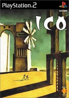
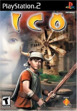
Put them together and the American cover stops looking like an insult and starts looking like what it was: the best a packaging studio could do before the painting existed.
THE PAINTING'S SOURCE
De Chirico, by way of Ueda