
Why is the American EarthBound box so big?
Every American copy of EarthBound, released June 5, 1995, came in a box significantly larger than the standard SNES box of the era, and the reason was physical, not decorative: the Player's Guide was packed inside, in place of a slim instruction booklet. The US box art says so on its face, with a corner banner promising a free Player's Guide inside. Nintendo was, in effect, selling a book with a cartridge attached, on the theory that a game this strange needed its guide in every buyer's hands from the first hour.
The decision cost money at both ends. The reference record notes the American campaign was expensive partly because of the strategy guide included with each game, and Shacknews writer Aaron Linde believed the resulting price of the packaged game ultimately curtailed its sales. The big box is therefore part of the failure story as well as the collector story: it raised the shelf price of an already hard to explain game, in the year Nintendo spent about $2 million telling America that the game stank.
Japan made the opposite object. Mother 2's Super Famicom box is a standard box carrying one of the most minimal covers of the 16 bit era: a flat red field, the word MOTHER with a planet set into the O, a gold 2, and nothing else. No characters, no screenshots, no promises. Nintendo Life, comparing the two, called the Japanese design gorgeous and minimal, and noted the American art, the Final Starman with Ness reflected in its visor, over swirling patterns borrowed from the game's battle backgrounds. The American box art is credited to Mike Takagi. One package is a logo. The other is an argument.
The guide, at least, outlived the argument. When EarthBound returned on the Wii U Virtual Console in July 2013, Nintendo included a free online recreation of the original Player's Guide, formatted for the GamePad, an admission that the book had become part of the work itself. And the red held in Japan: Mother 3's 2006 Game Boy Advance box kept the same red field and wordmark only treatment, eleven years on. America got the big box once. Japan got a design language.
THE PAIR, AT FULL SIZE
One logo, one argumentMother 2 vs EarthBound packaging
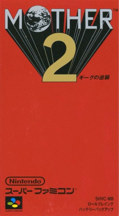
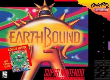
For collectors the consequence is permanent. A complete American copy means the big box and the book together, and the book is the part that gets read, bent, and lost. Completeness, for this game, is a publishing format.