
Why is the original Mega Man box art so bad?
The facts are documented in the game's own historical record. Capcom's American localization of Rockman was rushed, and the president of Capcom USA told the company's marketing representative to have a cover done by the next day. The rep handed the job to a friend, who produced the most famous bad cover in the medium in about six hours, working without the game to look at.
Everything wrong with it was catalogued by the man who drew the real Mega Man. Keiji Inafune, artist of the Japanese box and the character himself, blamed the cover for the game's weak American start, and his list is exact: Mega Man resembles a middle-aged man rather than a boy; his costume is yellow and blue instead of blue; and he holds a handgun instead of wearing his arm cannon. Producer Yoshiki Okamoto has said the Japanese staff had to defer to Capcom USA's marketing, who wanted art that would be appealing and popular in North America, and that he still wishes he could have stopped it.
The afterlife is the redemption arc. The game sold on word of mouth anyway, the sequel's success made the series permanent, and Capcom eventually embraced the joke completely: deliberately retro press art for Mega Man 9 and 10 in the same style, and Bad Box Art Mega Man himself, paunch, pistol and all, as a playable character in Street Fighter X Tekken (2012). The worst cover in games became a mascot. It just took twenty-five years.
THE TWO 1987 BOXES
Six months apart, one ocean apartRockman vs Mega Man
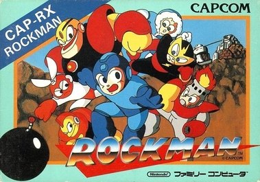
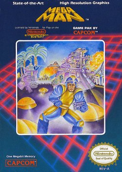
Side by side, the American cover is not a style choice. It is a picture of what Mega Man sounds like described over the phone, once, the night before deadline.