
Are Tokyo Ghoul covers the same in Japanese and English?
For both series and for the art book, Viz Media kept Sui Ishida’s Japanese cover paintings exactly and rebuilt the typography around them. What changes is the masthead: the Japanese editions run the title in large kanji, 東京喰種, with the reading given in small kana; the English editions replace it with a stacked Latin logo, TOKYO GHOUL, whose O is drawn as a red ghoul’s eye. Author credit moves too: 石田スイ sits inside the Japanese design, while “SUI ISHIDA” is set in plain capitals at the edge of the English one.
Shown here are the three pairs this shelf can picture and check side by side: both first volumes and Zakki.
PAIR ONE
Tokyo Ghoul volume 1Volume 1, in both languages
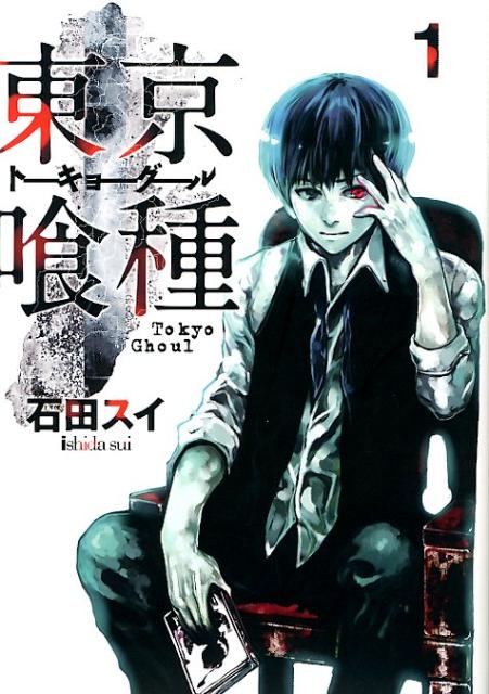
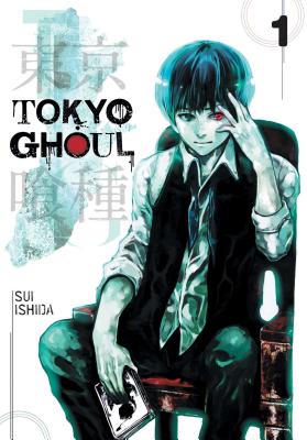
Viz kept Sui Ishida’s cover paintings across the whole English run and rebuilt the lettering instead. The full comparison is on the covers page.
PAIR TWO
Tokyo Ghoul:re volume 1:re Volume 1, in both languages
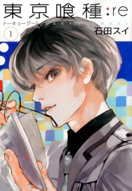
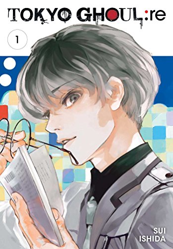
The sequel’s English edition follows the same rule as the first series: Ishida’s art, Viz’s lettering. See the covers page for the side-by-side record.
PAIR THREE
The illustration bookZakki, in both languages

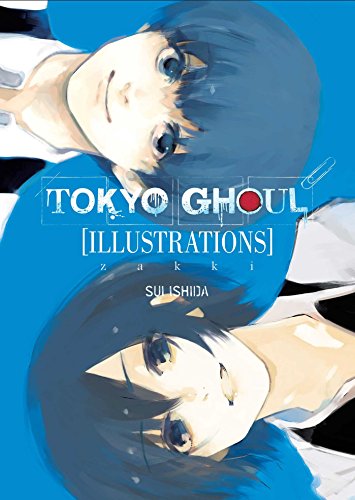
The art book makes the policy plainest: identical art, and even the title is re-set rather than translated in place.