
Why did Persona 5's menus and UI become famous?
Most games hide their menus. Persona 5 put its menus in the trailer. Producer Kazuhisa Wada opened Atlus's own developer panel on the subject, at CEDEC + KYUSHU 2017, by showing the first Persona 5 promotional video and noting that it is not easy to fit plenty of UI shots into a trailer: the UI, he said, is a big feature of this game, and the audience reaction at the time was a surprised What is that UI? The fame was not an accident that happened to a functional interface. The interface was designed, from a stated policy, to be looked at.
The policy has a name in the panel record. Art director and lead UI designer Masayoshi Suto described the Persona series UI as carrying two jobs at once: transmitting information, and building the graphic design that guides the whole project. His phrase for the second job was blunt: the UI team holds the mission of creating the package for the title. A menu system that is the package will be famous or infamous; Persona 5's team made sure it was the first.
The box the menus had to match
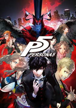
Suto's method starts with color, because color is the impression that stays: red for Persona 5, blue for Persona 3, yellow for Persona 4, a shocking pink for Catherine.
WHERE IT STARTED
A crisis at Atlus, and a low budget answerWada traced the approach to Persona 3 and to trouble. Atlus's consumer division was in a crisis summed up in the phrase Atlus games are interesting, but they do not sell, and Persona 3, arriving six years after Persona 2: Eternal Punishment, had the mission of innovating the series image and broadening the audience on a low budget. The derived policy was to strengthen the UI thoroughly, changing it from an unsung hero into a strong assertive hero: a low cost way to strengthen the title's colors, gather its resources, and improve the experience all at once. Director Katsura Hashino's version of the same brief, in the Persona 5 record, is that earlier Persona games were considered fun but not well marketed, so the UI was designed to attract a larger, more mainstream audience, and to show how a shift in perspective could turn a dull life exciting. The early Persona 5 UI designs overshot: so aggressively animated that they obscured the game, they were toned down and the text reoriented until style and readability balanced.
THE METHOD
Pop punk, guide lines, and a posing heroSuto's stated concept for Persona 5 was pop punk: pop as mass oriented, punk as anti-establishment. Working method, in his account: decide the main color first, then the title logo, then the key font. For Persona 5 he then refused the usual safety net, using almost no subcolors beyond the health and magic meters, so the passionate red would stand out. Readability was protected by other means: the nature of line of sight, with lines used as reference points to guide the eye, a white line drawn at the center of the menu screen to lead the gaze, layouts and angles shifted as the player moves deeper, and lighting raised where information matters and lowered where it does not. The menus' moving 3D model of Joker was built with a special tool: layout in Photoshop, a pose captured by the motion designer, then a 2D texture cut matched to the final pose. Even the hero's menu pose has a stated reference: a Hollywood star's Don't take my picture gesture against the paparazzi.
THE FAME, DOCUMENTED
Trailers, reviews, and two famous admirersThe reception record matches the intent. Before release, GameSpot was already writing that the menus were positively dripping with style and that the UI took an element usually treated as an unimaginative afterthought and made it more interesting than most games. On release the game's graphical style and art direction received significant praise alongside a 93 on Metacritic, and Persona 5 was nominated for Best Art Direction at The Game Awards 2017, winning Best Role Playing Game. The afterlife is the unusual part: the UI kept being cited by other designers. The retrospective record names Masahiro Sakurai, the creator of Super Smash Bros., and Guillaume Broche, lead director of Clair Obscur: Expedition 33, as both having praised Persona 5's stylish UI design as among their favorite. Menus are not supposed to have a fan base among rival directors. These ones do, because they were built to be the package, and the package is what people remember.