From the Library: covers, censuses, and editions, documented. Browse the Library →
SOJ Silent Hill ยท The Covers
← Back to the Library

Why do the Japanese Silent Hill covers look different from the American ones?

Because the two regions sold the same nightmare in opposite designs.

No shared cover programme ever existed. Konami's American and Japanese arms packaged Silent Hill independently, and they reached opposite conclusions about what sells horror: America put a person on the box; Japan put a design on it. The evidence is the covers themselves, side by side below.

THE TWO GAMES

Portrait versus design, twice

Silent Hill, 1999

Character cover versus warning sign
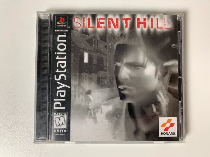
Silent Hill American PlayStation cover
AmericaA greyscale photographic portrait of Harry Mason laid over the foggy town. The hero's face is the product.
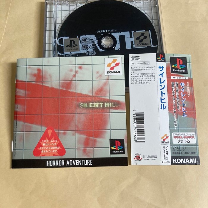
Silent Hill Japanese PlayStation cover
JapanThe portrait is thrown away entirely: a blood-red splatter design over a street-map grid, closer to a warning sign than a movie poster.

The first game set the pattern. America sold the man; Japan sold the map he is lost in.

Silent Hill 2, 2001

Face versus architecture
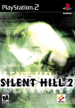
Silent Hill 2 American PlayStation 2 cover
AmericaA green-tinted face, Angela's, surfacing through the fog. Again a person, again half-dissolved in the town's weather.
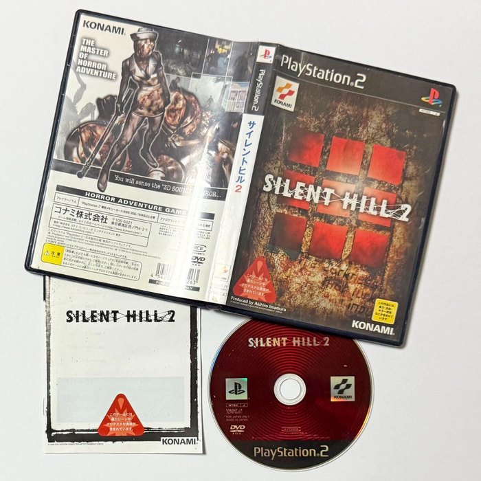
Silent Hill 2 Japanese PlayStation 2 cover
JapanA dark interior lit by red window panes. No face at all: architecture, dread, and negative space.

Twice in a row, the same split. American Silent Hill covers are portraits emerging from fog; Japanese ones are graphic compositions that withhold the people entirely.

What is Saigo no Uta?Why is Silent Hill covered in fog?The full story: The History of Silent Hill 2 →
MORE FROM THE SILENT HILL ARCHIVE →
One shelf of eighty-two in the Library. Browse them all →

THE FIRST WORD

New pages and new pieces, first.